When working on a Story in the Digital editor, you might also want to control how the text is styled. Studio offers various ways of doing this, ranging from basic to advanced.
This beginner's guide shows how simple style changes can be made quickly and easily.
Ways of styling a Story
Before we start it is important to understand that style changes can be made in the following ways:
- You can change the styling of selected text by applying a style such as 'bold' or by applying a character style.
- You can change the styling of a component by changing the properties for that component or by applying a Style variant. Think of styling such as aligning text, setting a drop cap and defining spacing.
- You can change the styling of the whole Story by applying a pre-defined style or by editing the CSS code. Applying a different style makes it possible to control the complete look and feel of the Story.
Each method is described in more detail below by using some examples.
Note: If some of the features described here do not appear on your screen, you may not have been given permission to use them.
|
Info: Use the filter to only show information for specific methods:
|
Styling selected text
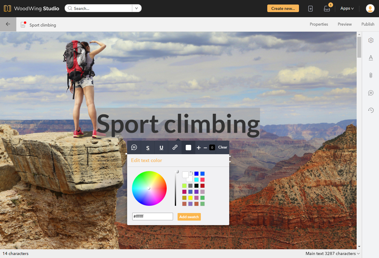
The simplest way of changing styling is by selecting some text. When doing so, the editing tools appear with which the following can be done:
- Local styling can be applied:
- Drop shadow
- Bold
- Italic
- Strikethrough
- Underlined
- Subscript
- Superscript
- Uppercase
- Lowercase
- Text color
- Text background color
- Font size
- A character style can be applied. A character style typically contains multiple styling such as emphasis, font size or color and is predefined and managed in a Style (typically by system administrators or super users).
Using this method, we will make some simple changes to the way a Hero component looks by doing the following:
- Changing the color of the title
- Changing the text size of the Author
This is how the Hero component looks before making the changes:

This is how the Hero component looks after making the changes:

To make these changes, we simply select the text that we want to change. As soon as we do this, the editing tools appear.

Changing the color
To change the color we click the color tool, choose a color from the color palette and apply the color by clicking anywhere outside of the color palette.
Note that we can also use the color palette to change the background color of the text and to save a used color as a swatch for re-use.
Changing the size of the text
To change the size of the text we select the text and click the '+' icon to increase the size or the '-' icon to decrease the size. The change relative to how it was before is also displayed as a value: in our case '5'.

Styling a component
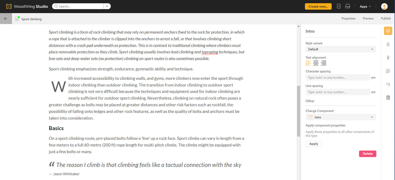
Digital articles consist of components. Sometimes, the complete content of a component needs to be styled in a certain way. For example: all text should be right-aligned or have a certain line spacing.
Such changes are made on component level by manually setting the properties of the component or by choosing a Style variant containing pre-defined settings.
Manually changing the properties
If you only want to make a small change for a single component, it is probably easiest to do so by changing the properties for that component.
Step 1. Select a component or place the cursor in the text of a component.
Step 2. Open the Component Properties panel (see image above) by clicking the icon in the toolbar on the right.
Step 3. Make the changes you want.
Depending on the type of component, you can change the following:
- Text alignment (left, center or right)
- Drop cap
- Character spacing
- Line spacing
Step 4. (Optional) Apply these settings to all other components of the same type by clicking Apply under Apply component properties.
Choosing a Style variant
Note: The options with which a component can be styled can be finely controlled. This could be as a Style variant as described below, and/or a completely different option.
A Style variant is a collection of style settings that are stored for repeated use. This makes it possible to apply these settings in one single action instead of having to set these manually.
A Style variant is typically a style that is often used, such as a particular way of styling a quote or a footer. It is pre-defined in advance and because this is done through CSS code, they can be quite powerful. (See Styling a Story in the Digital editor by using Styles.)
To apply a Style variant to a component, simply choose it from the Style variant list in the Properties panel for that component.

Styling the whole Story

Creating a Story in Studio is done by basing it on a Digital article template. This template contains a Style that controls the look and feel of how the Story should look.
In some scenarios though, you may want to change this style to bring it in line with the house style of your company or the brand that the article is for.
Several of such Styles will most likely be available for you. You can either use them as-is, or — when you have sufficient rights — make small adjustments to them.
Both actions are done from the Look and Feel panel which can be accessed by clicking the button in the toolbar on the right.
![]()
Applying a different style
To apply a different Style, simply select one from the list. The changes will be immediately applied.
Making small changes to an existing Style
We will now show how you can make small adjustments to an existing Style. This is done by making simple changes to the code.
Before you startBefore you start though, realize that all these settings are part of a 'Style' which is probably not only applied to the current Story that you are working on but may also be applied to other Stories. This means that any changes you make can also affect other Stories. If you only want to make the changes for the current Story it is best to first duplicate a Style and modify that Style. For information about creating new Styles or making advanced changes, see Styling a Story in the Digital editor by using Styles. Also make sure to use a compatible Web browser. Do I need programming skills?Even when you have never changed styling by editing CSS code before, the process is relatively straightforward and simple changes can be easily made without in-depth knowledge of working with CSS code. Still, some basic knowledge of CSS will come in handy (actually, Studio makes use of SCSS, an extension of CSS). You will need to be given Access Rights though to create or edit Styles. When you do not have sufficient rights, the tools do not appear. |
The Style that the Story currently has assigned is shown in orange.
Hover your mouse just below the name of the Style that you want to modify and click the Edit button.
![]()
The Style Editor is opened.
The styling can be changed for each individual component (such as the Hero, the header, the body text or image) or for the background of the Story. The code that is shown in the Style Editor is only the code for the selected component or for the background of the Story. This way you do not have to scroll through sections of code that are not relevant to what you want to change.
Examples
Example 1: Changing the background color of the Story
To display the CSS code for the background of the Story, we click anywhere outside of a component in the Story itself, or we select 'Common' from the list at the top of the Style Editor.
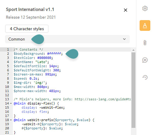
Figure: We can change the color of the background by choosing 'Common' from the list to show the code that we need. The color of the background is defined in line 2.
The color of the background is defined by a property named $bodyBackground and we can simply change its value to any color we want. We do this by replacing the current value '#ffffff' (which represents white) by the value of the color that we want. This new value could simply be the name of the color such as 'red' or 'blue' or a specific value such as '#FFFF00' for yellow.
Tip: For more information about color values, see w3schools.com - Web colors.
Here, we change the color to 'azure'.
$bodyBackground: azure;After waiting for a few seconds, the change is automatically applied and we can see the color of the background change in our Story.
Example 2: Changing the color of all dropcaps
In this example we will clearly see the strength of making changes to the CSS code: by making one change we can see the result in multiple places in the Story.
In our Story we have multiple body components that use a dropcap:
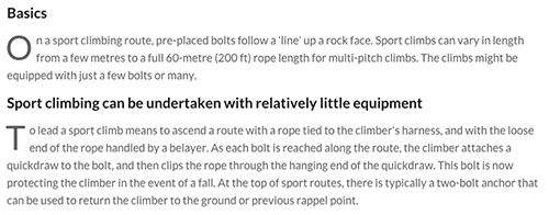
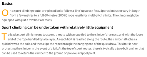
We want to change the color of the dropcap to orange but when checking the code in the Style Editor (by clicking in the text in the Story or by selecting 'Body Component' in the Style Editor) we see that no property exists yet for setting the color of the dropcap:
/* Body component style */
.body {
    font-weight: 400;
    font-size: 18px;
    font-style: normal;
    line-height: 1.6;
    color: #606060;
    margin: 12px auto;

    /* class style for the DropCap property of the body component */
    &._drop-cap {
        &:not(.doc-empty) {
            &:not(.doc-component-highlight) {
                min-height: 80px;
                &::first-letter {
                    font-size: 300%;
                    text-transform: uppercase;
                    line-height: 0.8;
                    float: left;
                    margin: 4px 6px 0 -2px;
                }
            }
        }
    }
    /*
     * media query
     * $screen-sm-max constant is defined in the global style file (_common.scss)
     */
    @media (max-width: $screen-sm-max) {
        font-size: 17px;
        line-height: 28px;
    }
}
We therefore need to add the color ourselves by adding the following line:
color: orange;
/* Body component style */
.body {
    font-weight: 400;
    font-size: 18px;
    font-style: normal;
    line-height: 1.6;
    color: #606060;
    margin: 12px auto;

    /* class style for the DropCap property of the body component */
    &._drop-cap {
        &:not(.doc-empty) {
            &:not(.doc-component-highlight) {
                min-height: 80px;
                &::first-letter {
                    font-size: 300%;
                    text-transform: uppercase;
                    line-height: 0.8;
                    float: left;
                    margin: 4px 6px 0 -2px;
                    color: orange;
                }
            }
        }
    }
    /*
     * media query
     * $screen-sm-max constant is defined in the global style file (_common.scss)
     */
    @media (max-width: $screen-sm-max) {
        font-size: 17px;
        line-height: 28px;
    }
}
Tip: For more information about color values, see w3schools.com - Web colors.
And this is the result: all dropcaps are now orange:
Example 3: Changing the font
Choosing the right fonts for your Story is probably the most important decision to make when deciding how your story should look. When using the Style Editor, changing a font is very straightforward.
Choosing your font
Whatever font you choose, it is important that whoever will read your story also has access to the same fonts. On the Web this is made easy by for example making use of Google fonts. These fonts are available online and are automatically downloaded by the Web browser on the system of the person who reads your story. You therefore don't have to worry about distributing fonts: this is all taken care of by (in this case) Google.
Changing our font
In this example we will change the font for the whole Story.
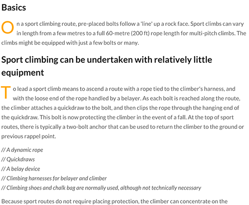
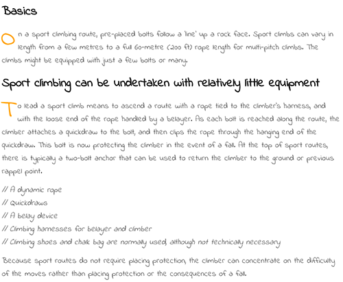
The current font in our story is the default font named 'Lato' and we want to change that to a font named 'Indie Flower' (just for the sake of showing a clear difference here between the font styles).
This is how our Story currently looks:
This is how we want our Story to look:
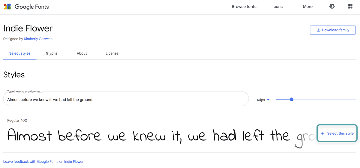
For our example therefore, we visit Google Fonts, look up the Indie Flower font, and click +Select this style.
In the panel that appears we select the @import option:
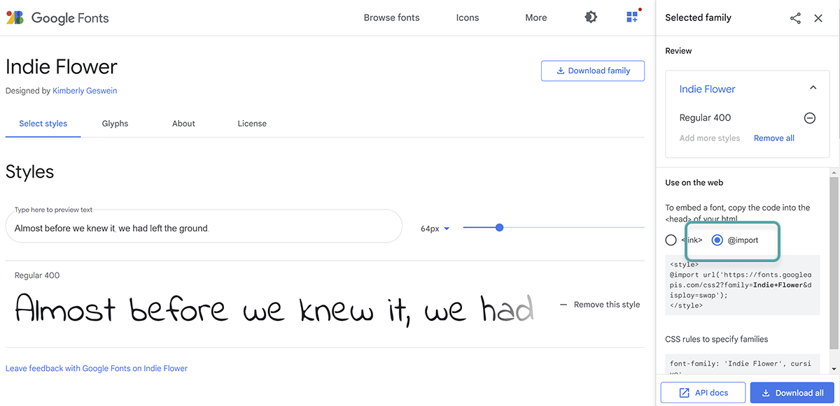
We copy the text that is shown:
@import url(https://fonts.googleapis.com/css?family=Indie+Flower);
We return to the Style Editor in Studio and make sure that 'Common' is selected in the list so that the code for the Story itself is shown.
We make 2 changes:
- In line 4 for we change the name of the font style:
$fontName: "Indie Flower";
- In line 23 we replace the "@import" reference by the text that we have copied.
/* Constants */
$bodyBackground: #ffffff;
$textColor: #000000;
$fontName: "Indie Flower";
$defaultFontSize: 14px;
$defaultFontWeight: 300;
$screen-sm-max: 991px;
$speed: 0.2s;
$img-dir: 'img/';

/* Mixin's helpers, more info: http://sass-lang.com/guide#topic-6*/
@mixin display-flex() {
    display: -webkit-flex;
    display: flex;
}
@mixin webkit-prefix($property, $value) {
    -webkit-#{$property}: $value;
    #{$property}: $value;
}

/* Font embeds, examples see: https://www.google.com/fonts */
/* Imports the style from the google fonts cdn */
@import url(https://fonts.googleapis.com/css?family=Indie+Flower);
And that is all we need to do: after a few seconds we see the font of our Story change.
Comments
0 comments
Please sign in to leave a comment.