Panel plug-ins are one of the ways of extending the functionality of Assets Server. They appear in Assets in the form of a panel.
The functionality of the panel can be used in 2 ways:
- To display specific information about selected assets, such as that from a PIM system, or analytics data about various ways in which assets are used
- To perform a specific action such as applying copyright metadata information
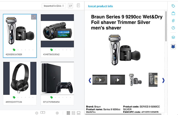
Figure: In this example, a panel is added showing product information for a selected asset, derived from an external PIM system.
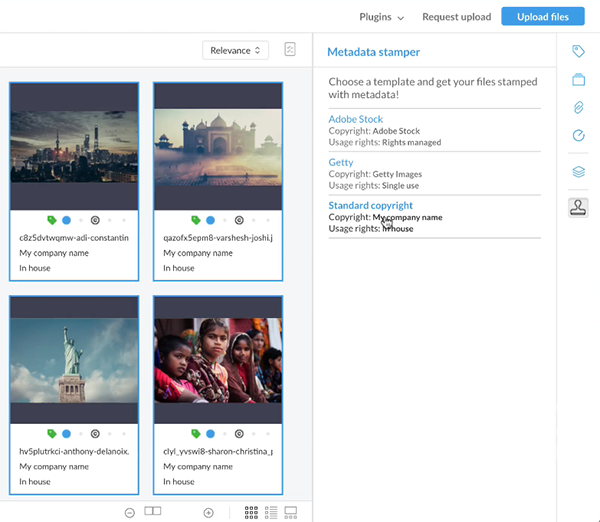
Figure: In this example, a panel is added containing options to quickly apply specific copyright metadata to selected assets.
Where the panels are displayed
Panel plug-ins can be displayed in the following locations:
- On the main screen
- In the Upload screen (requires Assets Server 6.49 or higher)
Where to get Panel plug-ins from
Panel plug-ins contain custom functionality and are typically created whenever the need for that functionality arises. Sample plug-ins are provided as separate open source samples in the Integrations & Samples section on the Help Center (log-in required). These can be used as a starting point for creating your own Panel plug-ins, as described below.
Note: The use of sample plug-ins has been deprecated in Assets Server 6.73. Plug-ins should instead be created as an external plug-in.
For information about how to install and activate Panel plug-ins, see Working with internal plug-ins in Assets Server.
Creating your own Panel plug-in
Note: Panel plug-ins should be created as an external plug-in (requires Assets Server 6.59 or higher). The alternative method of using internal plug-ins has been deprecated since Assets Server 6.73.
Panel plug-ins are very similar to Action plug-ins, with a few exceptions (see Configuration settings). Please read Adding custom functionality to Assets Server by using Action plug-ins for details.
In short, a Panel plug-in consists of the following components:
- Configuration files describing the functionality
- An HTML file that is displayed in the panel
- An icon for the button to open and close the panel with
Configuration settings
The following is a full list of available configuration settings.
Note: More settings are available for Action plug-ins, but these are not supported for Panel plug-ins. Also, some settings are specific only to Panel plug-ins and not to Action plug-ins.
<?xml version="1.0" encoding="UTF-8"?>
<plugin>
    <info>
        <version>
            <pluginVersion>1.0</pluginVersion>
            <requiresAtLeast>6.1.0.0</requiresAtLeast>
            <testedUpTo>6.1.0.0</testedUpTo>
        </version>
        <description>Description of your plugin</description>
        <documentationUrl>URL to the documentation </documentationUrl>
    </info>
    <panel>
        <url>${pluginUrl}/index.html</url>

        <iconUrl>${pluginUrl}/icon.png</iconUrl>

        <panelLocations>
            <panelLocation id="mainRightPanel" order="1"/>
        </panelLocations>

        <requiredRoles>
            <role>ROLE_CUSTOM_PANEL_MYPANEL</role>
        </requiredRoles>

        <messages>
            <entries locale="en_US">
                <entry key="title">Plugin panel title</entry>
                <entry key="button.tooltip">Plugin button tooltip</entry>
            </entries>
        </messages>

    </panel>
    <config>
        <property name="myProp">
            <description>Property description</description>
            <value>Property value</value>
        </property>
    </config>
</plugin>
Most settings are self explanatory. Below follows some additional information about some of the settings:
- iconURL. (Required) A link to an icon to show in the navigation bar on the right of the page. It should be 24x24 pixels in size and can be any file format that is supported by Web browsers (such as PNG, SVG or JPG).
- panelLocation. (Required) Use one of the following:
- mainRightPanel. For adding the panel to the right side of the main screen.
- uploadPanel. (Requires Assets Server 6.49 or higher) For adding the panel to the right side of the Upload screen.
- panelLocation order. Panel plug-in icons are always displayed below the default panel icons. When multiple Panel plug-ins are available, the order in which they are placed in relation to each other can be defined. The lower the number, the higher up the icon is displayed.
- requiredRoles. (Optional) Used for controlling user access to the plug-in. It works in the same way as for Action plug-ins (see Assets Server action plug-ins - Defining user access).
Creating a custom HTML page
A custom HTML page should be created — including JavaScript and CSS — which is displayed in the panel. Please keep the following in mind:
- The elvisContext JavaScript variable is available in the HTML page with information about the client state (such as user profile, asset selection, and so on). A few differences to elvisContext exist compared to Action plug-ins:
- Selection change notification. The elvisContext.updateCallback function can be used to register your own callback handler. It is called by Assets when the asset selection changes. Specify a function without parameters and retrieve the new asset selection through the elvisContext.
|
Example: |
- Asset selection validation. Action plug-ins can enable or disable an action based on an asset selection and can filter the selection of hits that your plug-in receives (see the configuration properties enabledExpression, filterExpression, flattenContainersInSelection and removeContainersFromSelection). Panel plug-ins do not support this because a panel does not have a "disabled" state and because filtering a selection or flattening a container would hurt application performance. Make sure therefore that you:
- Use the elvisContext.activeTab.originalAssetSelection property when retrieving the asset selection as elvisContext.activeTab.assetSelection will never contain a value.
- Filter the asset selection so that it matches what your plug-in expects.
Comments
0 comments
Please sign in to leave a comment.